[Theme] Gingerbread Thyparancy Full Theme

  • 121 Antworten
  • Letztes Antwortdatum
Status
Für weitere Antworten geschlossen.
T

Thyrus

Gast
logothyging.png

GingerThyparancy V2.0

The theme is available as a FULL theme (root required) or as skin only version


FULL THEME - for 2.3.3 ROMS and 2.3.4 official OTA RUU based ROMs

If you are using a SENSATION (pyramid) ROM based on the HTC RUU 2.3.3 1.35.401.1 which is DEODEXED

or a SENSATION (pyramid) ROM based on the 2.3.4 WWE RUU 1.45.401.2 which is DEODEXED, this is the correct thread and the Theme will indeed run just fine.

Content: (Bold items reflect features not available when only using Thyparancy skin)

  • 6*5 Rosie app drawer, semi transparent
  • Themed notification bar, pulldown and quick settings
  • Themed Gmail, GenieWidget, Mail, Settings, Twitter, Youtube
  • Full theme includes basic GingerThyparancy skin, you can download the other versions as well (below) and install these as well
  • For the full theme, a deodexed ROM must be installed.

Screenshots full theme

mainye.png
aappdwawer.png


peoplez.png
pulldown.png


calendard.png
awidgets.png


aquick.png
apower.png


amail.png
agmail.png


Changelog

GingerThyparancy Sense 3.5 V1.0 FULL THEME - Oct 6th, 2011 - for Sense 3.5 based ROMS RUU 2.08.401.1
  • Theme adapted to Sense 3.5 ROMS
  • includes romanBBs extended quicksettings incl modified icons and black notification background
  • Minor changes and other minor fixes


GingerThyparancy V3.0 FULL THEME - Sept 16th, 2011 - for 2.3.4 XE based ROMS RUU 1.72.401.1
  • Theme adapted to XE based ROMs - based on RUU 1.72.401.1 (works with all XE-based ROMS)
  • Changed battery icons in statusbar
  • Minor changes (fixed default backgrounds for both Recent apps and No recent apps) and other minor fixes

GingerThyparancy V2.0 FULL THEME - Aug 13th, 2011 - for 2.3.4 OTA based ROMS RUU 1.45.401.2
  • New 6*5 Rosie App Drawer
  • Extended Quicksettings
  • Stock google Gingerbread icons for SMS/MMS, Browser and Phone
  • Theme tested for offical 2.3.4 RUU
  • 2 custom background images (for Rosie and Notification Pulldown) included in zip file. Default images are the semi transparent ones with a gradient. You can swap these custom backgrounds as described below

GingerThyparancy V1.0 FULL THEME - Aug 11th, 2011 - for 2.3.3 ROMS
  • Modifications to the Notification pulldown
  • Fully customizable backgrounds for Rosie app drawer and Notification Pulldown (see below)
  • Theme now stable and has been moved from release candidate to V1.0

GingerThyparancy RC2.0 FULL THEME - Aug 8th, 2011
  • Redesigned systemui.apk, the background in the notification pulldown can now be user-amended. Simply change status_bar_background in SystemUI.APK to your liking if you disagree with the level of transparency I have set (change it, copy to the drawable-hdpi folder (store only, do not compress), zipalign and push apk to system/app
  • Re-themed some other statusbar icons
  • Better battery optimizations (standard ziaplign doesnt work correctly with m10 files)
  • All tested on Virtuous Sensation ROM, but should work on any Sensation 2.3.3 de-odexed ROM.
  • 2.3.4 ROMs (currently only InsertCoin) have a special version available for download in the ROM thread

GingerThyparancy RC1.1 FULL THEME - Aug 4th, 2011
  • NEW: Changed battery icon
  • Uploaded version with no recent apps in pulldown notification menu

GingerThyparancy RC1 FULL THEME - Aug 3rd, 2011
  • NEW: Full Theme launched as RC1

GingerThyparancy RC1 - July 29th, 2011
  • NEW: Theme now available as straight, inverted, arched and inverted arched versions
  • NEW: Some Gingerbread highlights in applications such as phone
  • NEW: Stable released code 1 version, bugfixes from beta included
  • NEW: Themed popup windows
  • All HTC Settings widgets re-designed (within the limitations given by the skins)
  • New icons for People, Message and Calendar widget (calendar still not 100% due to annoying angle) :)


Installation

Full Theme
  • Backup your device with a nandroid backup
  • To install simply download the zip file and flash to your device using
    ClockWorkModRecovery. Then chose the Theme in Personalize -> Skin
  • To uninstall restore to a previous nandroid backup


Customizable backgrounds for Rosie App Drawer and notification background

You can now customize your own background as you would like. Add a picture of your loved ones, or a wallpaper, set transparency with a gradient, without a gradient, have it pure black, 100% transparent, whatever you would like.

HOW-TO CHANGE ROSIE BACKGROUND:

  • Copy Rosie.apk (either from my Theme or from your device) to your PC
  • Open Rosie.apk (resides in /system/app) in 7-zip or Winrar or whatever archieving app you might use
  • In the Rosie.apk, you will find an image file in res->drawable-hdpi called applistbackground.png
  • Copy that image (applistbackground.png) somwhere on your PC for editing
  • Modify as you please. Once you are satisfied, save as applistbackground.png again
  • Copy that modified image back to Rosie.apk, but do NOT let winrar or 7-zip compress it (store only in winrar)
  • Once that is done, use zipalign to re-align the Rosie.apk (google sdk android zipalign for how to do that. (this is not MANDATORY, the Rosie will work without zipalign, but properly zipaligning is highly recommended for batterylife)
  • The "new" Rosie.apk, properly zipaligned, not needs to go back to your device into the system/app folder. There are multiple ways to do that.
  1. Copying it to /data first, setting permissions 644 (rw-r-r) in root explorer, then copying it to /system/app and overwriting the old rosie.apk. You can then reboot your device and should see the changes upon reboot.
  2. The safer way I would simply be to use my "theme" download archive (the .zip of my themes) - extract the archive with folders, delete all files in /data/app and /system/app and system/framework, the copy the new Rosie.apk to /system/app. Then re-zip all content of the archive (so keeping my folder structure intact, the folders on the first level should be data, system and META-INF. Do not modify anything in the META-INF folder. Save new archive with a different name (such as Rosie.zip or MyRosie.zip or whatever).

Then copy that new zip file to your SD card, and flash in recovery.
That should be it.


HOW-TO CHANGE THE NOTIFICATION PULLDOWN BACKGROUND:

Just like I explained for Rosie, but this time, take the SystemUI.apk from the archive or device.
The image is stored in drawable-hdpi as well, called status_bar_background.png.
Proceed just like with Rosie, same process just different image name and file name.​
 
Zuletzt bearbeitet von einem Moderator:
  • Danke
Reaktionen: Thor1967, Druid-Didi, rauke und 6 andere
Skin only

As an enhancement of my HTC Sense 3.0 Skin "Thyparancy" I hereby present to you - GingerThyparancy. Select the skin via the Personalise-> Skin option.

The skin will work on all Sense 3.0 devices.
NOTE: For Sense 3.5 based ROMS, there is no skin as there currently is no m10 editor available for Sense 3.5 m10 files. Full Version ONLY.


Content: (Bold items reflect features not available in standard Thyparancy skin)

  • New semi-transparent Rosie navbar either straight or arched
  • Replaced and themed all HTC green highlights by the original Google Gingerbread color
  • Black notification bar/statusbar
  • Semi-transparent Sense 3.0 widgets with a Gingerbread Color
  • Modified lockscreen ring and background (smoked effect)
  • Themed popup windows
  • Works on all Sense 3.0 devices
  • Simply installation without root (installs via single apk file)

Installation

SKIN ONLY
  • To install simply download the apk file from the market. Then chose the Theme in Personalize -> Skin
  • To uninstall go to the skin picker menu (Personalise -> Skin), hit the menu button, select delete and confirm or uninstall via the Android Market.


Screenshots - Skin Only version


norm1.png
locknorm.png


widgetson.png
widgetsoff.png


wallpaperselect.png
volumeb.png


skinselect.png
brigtness.png


messagesli.png
messagee.png


Arched and inverted versions

arched.png
gininv1.png


archinv.png
lockarch.png
 
Zuletzt bearbeitet von einem Moderator:
  • Danke
Reaktionen: DerMaurice, dr4go, Syrabane und 3 andere
IMPORTANT

The full theme consists of 2 parts - the Theme itself and the skin for Sense 3.0 ROMS. NOTE: For Sense 3.5 based ROMS, there is no skin as there currently is no m10 editor available for Sense 3.5 m10 files. Full Version ONLY.


I have included V1.0 of the normal Thyparancy skin, feel free to download the other versions (inverted, arched, archedInverted) from the Market if you prefer them).

In order to get the full experience, you should use the THEME and apply the respective Thyparancy skins in Personalize-> Skins.

Downloads

WALLPAPER COLLECTION
Download Wallpapers that fit the Thyparancy Themes

FULL THEME GingerThyparancy Sense 3.5 V1.0 - Oct 6th, 2011 for Sense 3.5 based ROMS (ROMS RUU 2.08.401.1)
DOWNLOAD V1.0 - WITH recent apps enabled in Notification Pulldown


FULL THEME GingerThyparancy V3.0 - Sept 16th, 2011 for XE based ROMS (1.72.401.1)
DOWNLOAD V3.0 - WITH recent apps enabled in Notification Pulldown
DOWNLOAD V3.0 - WITHOUT recent apps in the Notification Pulldown


FULL THEME GingerThyparancy V2.0 - Aug 13th, 2011 for 2.3.4 official OTA based ROMS
DOWNLOAD V2.0 - WITH recent apps enabled in Notification Pulldown
DOWNLOAD V2.0 - WITHOUT recent apps in the Notification Pulldown


FULL THEME GingerThyparancy V1.0 - Aug 11th, 2011
DOWNLOAD V1.0 - WITH recent apps enabled in Notification Pulldown
DOWNLOAD V1.0 - WITHOUT recent apps in the Notification Pulldown


SKINS ONLY: GingerThyparancy official release Version 1.0 - August 10th, 2011
GingerThyparancy Straight Version on the market
GingerThyparancy Arched Version on the market
GingerThyparancy Inverted Version on the market
GingerThyparancy Arched and Inverted Version on the market
 
Zuletzt bearbeitet von einem Moderator:
  • Danke
Reaktionen: DerMaurice, Syrabane, ZerockzZz und eine weitere Person
Schickst jetzt doch wieder ein paar Skins hier her? ;)
Naja, egal. Sieht schonmal verdammt klasse aus.

Kritik:
- Das mit dem grünen Rand um alle Menüs ist einfach nur: GEIL! Allein das ist schon ein Grund das Theme sofort zu saugen.
- Die eckigen Widgets mochte ich anfangs nicht, inzwischen gefallen sie mir richtig gut.
- Die schwarze Statusleiste ist geschmackssache. Ich finde, sie wirkt etwas..."platt".

Weißt du ob der Skin auch in der geleakten 2.3.4 funktioniert. Würde ihn dann doch gerne benutzen.

mfg Marcel
 
die gruenen menus habt ihr he_stheone64 zu verdanken :) ich habe die mir "gemoppst"
 
Soso, gemopst.

Kannst du nich noch die Apps aus den Benachrichtigungen rausschmeissen? Büdde! *Dackelblick*
 
Die sind klasse, hatte die jetz in so nem komischen blau von nem theme, aber deines schaut 1000mal besser aus =)
 
Suspiria schrieb:
Soso, gemopst.

Kannst du nich noch die Apps aus den Benachrichtigungen rausschmeissen? Büdde! *Dackelblick*

au ja das wäre echt super =) ich schätze mal das ist ne anpassung der framework oder?

edit: irgendwie ist mir gerade nach nem green lantern wallpaepr xD
 
Zuletzt bearbeitet:
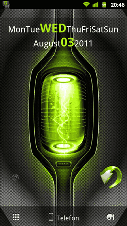
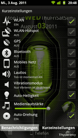
Woah, sieht ja echt klasse aus! Die Batterieanzeige is n bisschen schlecht zu lesen, macht aber nix. Dafür sind die Kurzeinstellungen einfach nur Hammer. Und der radioativ grüne Rand - lecker. Mal n kurzer Einblick wie es bei mir grad aussieht:

20110803204609.png 20110803204810.png

Weiter so! :thumbup:
 
Thyrus schrieb:
die gruenen menus habt ihr he_stheone64 zu verdanken :) ich habe die mir "gemoppst"

Wusste doch das es mir bekannt vor kommt. :flapper::flapper:
 
hier mal mein WIP

- neue battery (lesbarer)
- keine recent apps mehr

bitte um feedback

newbatt.png
norecentapps.png
 
Yo, das sieht gut aus! Was auch noch genial wäre, ne halbtransparente Statusbar. Dann wärs echt perfekt ;)
 
Was mir nicht ganz gefaellt, dieses "+" und das Gruppenzeichen beim HTC Widget People. Das sieht immer so aus, als ob das ein kleines Kind da dranne geklebt haette. Weiss nicht genau, wie ich das erklaeren soll. Im Original sieht genau der Punkt besser aus.
 
Ich fand auch die Widget Icons oben beim alten Thyparancy schöner. Vor allem das grüne beim Kalender. Die grauen Teile passen irgendwie net so recht ins Bild...
 
v1.1 uploaded
 
  • Danke
Reaktionen: Syrabane und Suspiria
Suspiria schrieb:
Yo, das sieht gut aus! Was auch noch genial wäre, ne halbtransparente Statusbar. Dann wärs echt perfekt ;)

es gibt einen guten grund, warum ich keine sem-transparente statusbar nutze
 
Sieht gut aus!
 
Grundsätzlich super! Dein Nick in "schlicht" macht sich auch ;)

Aber - könntest du ggf. den Kontrast der Grauabstufungen in GMail etwas erhöhen? Ich kann da quasi nicht erkennen was gelesen ist und was nicht.

Für meinen Geschmack ist auch die Transparenz in den Benachrichtigungen/Schnelleinstellungen etwas zu hoch. Gibt es da ne Möglichkeit das selber einzustellen oder wärst du bereit hier selber nochmal Hand anzulegen?

PS: Gut siehts eh aus - aber der Nutzen geht ein wenig verloren ;)
 
also

-die benachrichtungsleiste könnte etwas weniger transparent sein,
-die beschreibung der elemente in der benachrichtung müsste hell sein (hab ein schwarzes hintergrundbild und da kann man garnichts lesen) also bei appinstallationen und sowas

welchen rgb code hat das grün das du verwendest?
 
Neoby schrieb:
also

-die benachrichtungsleiste könnte etwas weniger transparent sein,
-die beschreibung der elemente in der benachrichtung müsste hell sein (hab ein schwarzes hintergrundbild und da kann man garnichts lesen) also bei appinstallationen und sowas

welchen rgb code hat das grün das du verwendest?

1 - fixed

newtransp.png


2 - ist eh hell
3 - 82B600
 
Zuletzt bearbeitet von einem Moderator:
  • Danke
Reaktionen: Neoby und Syrabane
Status
Für weitere Antworten geschlossen.

Ähnliche Themen

TomTim
  • TomTim
Antworten
1
Aufrufe
2.761
Schoppenmeister
S
TomTim
  • TomTim
Antworten
5
Aufrufe
3.415
TomTim
TomTim
HTC_Freak
Antworten
0
Aufrufe
4.244
HTC_Freak
HTC_Freak
Zurück
Oben Unten